Typefaces
Each typeface has a unique tone that should produce a harmonious fit between the verbal and visual flow of your content. With the first versions of HTML, Web authors had no control over typefaces ("fonts" in personal computer terminology). Fonts were set by the browser, so pages were viewed in whatever font the user specified in his or her browser preferences. The more recent versions of HTML and CSS allow designers to specify the typeface. This is useful not only for aesthetic reasons but also because of the differing dimensions of typefaces. A layout that is carefully designed using one face may not format correctly in another.
In specifying typefaces you should choose from the resident default fonts for most operating systems. If you specify a font that is not on the user's machine, the browser will display your pages using the user-specified default font. Bear in mind, too, that users can set their browser preferences to ignore font tags and display all pages using their designated default font.
Legibility on screen
Some typefaces are more legible than others on the screen. A traditional typeface such as Times Roman is considered to be one of the most legible on paper, but at screen resolution its size is too small and its shapes look irregular. Screen legibility is most influenced by the x-height (the height of a lowercase "x") and the overall size of the typeface.
Adapted traditional typefaces
Times New Roman is a good example of a traditional typeface that has been adapted for use on computer screens. A serif typeface like Times New Roman (the default text face in most Web browsers) is about average in legibility on the computer screen, with a moderate x-height. Times New Roman is a good font to use in text-heavy documents that will probably be printed by readers rather than read from the screen. The compact letter size of Times New Roman also makes it a good choice if you need to pack a lot of words into a small space.
Designed for the screen
Typefaces such as Georgia and Verdana were designed specifically for legibility on the computer screen; they have exaggerated x-heights and are very large compared to more traditional typefaces
in the same point size. These fonts offer excellent legibility for Web pages designed to be read directly from the screen. However, the exaggerated x-heights and heavy letterforms of these fonts look massive and clumsy when transferred to the high-resolution medium of paper.
Choosing typefaces
The most conventional scheme for using typefaces is to use a serif face such as Times New Roman or Georgia for body text and a sans serif face such as Verdana or Arial as a contrast for headlines. We generally set our text-laden Web pages in Times New Roman because it produces a reasonable balance between density of information and overall legibility. Most readers expect a serif font for long blocks of text and find Times New Roman comfortable to read off-screen from paper printouts. Various studies purport to show that serif type is more legible than sans serif type and vice versa. You can truly judge type legibility only within the context of the situation — on the screen — as users will see your Web page.
You may use either a variation of the serif font or a contrasting sans serif face for the display type. It is safest to use a single typographic family and vary its weight and size for display type and emphasis. If you choose to combine serif and sans serif faces, select fonts that are compatible and don't use more than two typefaces (one serif, one sans serif) on a page.
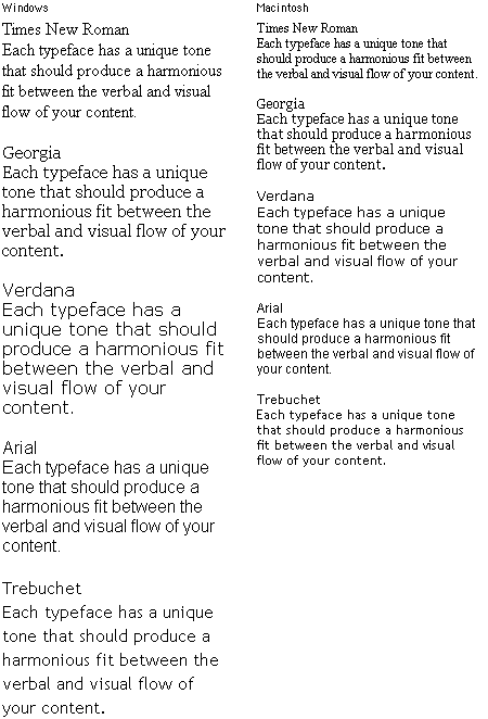
The most useful fonts that ship with the Apple Macintosh and Microsoft Windows operating systems are reproduced here (we have omitted bitmap fonts and decorative or novelty typefaces):

Specifying typefaces
The early versions of HTML did not allow designers to specify a typeface for Web documents. With version 3.2 came several new tags aimed at giving designers more control over the visual properties of elements, among them the FONT tag. Many of these have been "deprecated" by the World Wide Web Consortium, which means that they may be dropped from future versions of HTML. Although the added tags enable designers to create more elegant-looking pages, they also result in cumbersome code that is difficult to adapt and maintain. You can still use the FONT tag to set the type in your documents, but a better approach is to consolidate text formatting in style sheets.
You can specify any typeface for your Web pages, but many computers have only the default operating system fonts installed. If the typeface you specify is not available on the user's computer, the browser will switch to the default font (generally "Times New Roman" or "Times"). To increase the chances that the reader will see a typeface you are happy with, you can specify multiple fonts. The browser will check for the presence of each font (in the order given), so you can specify three or four alternates before the browser applies the default font, for example, "Verdana, Geneva, Arial, Helvetica." As a last-ditch effort you can end your font declaration with a generic font designation such as "sans serif." That way, if the browser cannot find any of the listed fonts, it will display the text in any available sans serif font.
P { font-family: "Times New Roman", Georgia, Times, serif }
Notice that multiword fonts like "Times New Roman" must appear within quotation marks.
A good way to make sure that your type settings are functioning correctly is to set your browser's default proportional font setting to something that is obviously different from your intended font. For example, set your browser's default font to Courier if you are not using Courier in your document. When you view your page, anything that appears in Courier must not be marked up properly.
| 