 | |
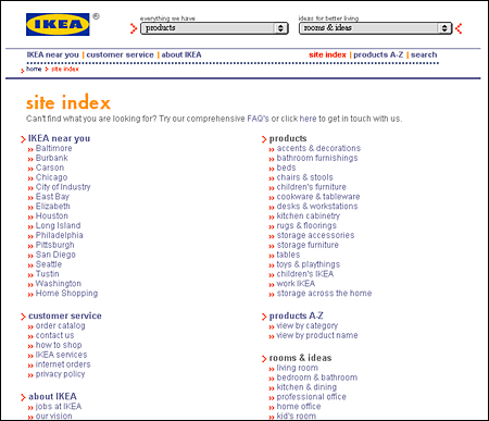
Site guidesUnlike print media, where the physical heft and dimensions of a book or magazine give instant cues to the amount of information to expect, Web sites often give few explicit indications of the depth and extent of the content available. This is especially true when the home page does not provide an extensive listing of internal site links. Although search facilities offer users quick access to your content, they are no substitute for a clear, well-organized exposition of your site's contents. Even the best search engines are relatively stupid and have only the most primitive means of assessing the priority, relevance, and interrelations of the information resources you offer in your Web site. Tables of contents or site indexesTables of contents and keyword indexes of the information in your Web site are an easy way to give readers a clear sense of the extent, organization, and context of your site content. Tables of contents and indexes are familiar print conventions; readers understand them and will appreciate the overviews, perspectives, and efficient navigation they afford. The main difference between Web-based indexes and their print counterparts is that a Web site index need not be as extensive or detailed as a book index because you can always use a search engine to find every obscure reference to a keyword. A Web site index should point to the most relevant and useful occurrences of a keyword and ignore minor references (those will turn up in a keyword search anyway).  Site mapsSite maps give the reader an overview of the site contents. Site maps come in two varieties: graphic diagrams that literally use the "map" metaphor and organized list links to major pages within the site. The form of graphic site maps varies from hierarchical branching diagrams to geographic metaphors, but they all share the same limitations:
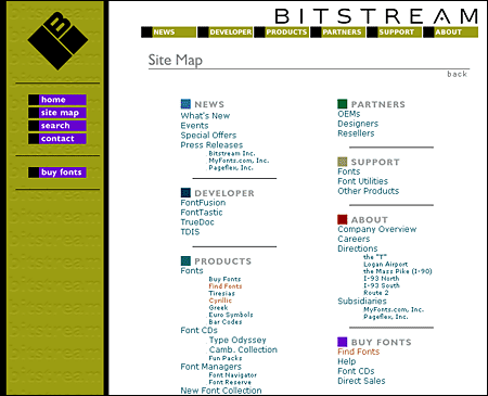
Site maps based on carefully organized text links of major menus and submenu pages and major page titles are much more informative than graphic maps and can easily be updated as your site matures. Most effective text site maps are really just expanded tables of contents. As such they are instantly familiar and understood by the vast majority of the readers in your audience. Bitstream's site map is a particularly well designed example of this type:  |
|
|