 | |
Home pagesAll Web sites are organized around a home page that acts as a logical point of entry into the system of Web pages in a site. In hierarchical organizations, the home page sits at the top of the chart, and all pages in the Web site should contain a direct link back to the home page. The World Wide Web URL for a home page is the Web "address" that points users to the Web site. In many cases, home page addresses are used more than home and business street addresses. The thirty square inches at the top of a home page comprise the most visible area of the Web site. Most readers will be looking at your site on a seventeen- to nineteen-inch monitor, and the top four or five vertical inches are all that is sure to be visible on their screens. The best visual metaphor here is to a newspaper page — position matters. It's nice to be on the front page, but stories "above the fold" are much more visible than those below. In sites designed for efficient navigation the density of links at the top of the home page should be maximal — you'll never get a better chance to offer your readers exactly what they want in the first page they see: 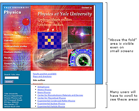 Home pages perform a variety of functions. Some designs primarily take advantage of the high visibility of the home page; it's the most visited page of your site and is therefore ideal for posting news and information. The high visibility of the home page also makes it the ideal place to put a menu of links or table of contents for the site. Navigation schemes in sites that use the home page for news and menu listings are often centered on the home page, using it as the "home base" for most navigation through the site. Other home page designs use the home page as the first opportunity to steer audiences into subtopic or special interest areas of the site. The following are the most common home page design strategies: Menu home pagesMenu-like lists of links dominated the design of most home pages in the first few years of the Web, and this remains the most common type of home page. Menu-style pages need not be dominated by plain lists of text-based HTML links — graphic imagemaps are often more space efficient, packing the maximal number of links into every square inch of the page. Sophisticated designs combine graphic imagemaps and blocks of text-based links. Text links offer less visual impact but are much easier to change on short notice. 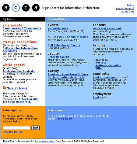 News-oriented home pagesThe home pages of such organizations as the New York Times and CNN (Cable News Network) are obvious examples here, but many organizations take advantage of the high visibility of their home pages to make announcements to both employees and the larger Web audience. Live information makes a home page more attractive and more likely to generate repeat visits. Many home page designs reserve one or more areas for late-breaking news, calendar events, or alert messages. If you choose this approach, standardize the location and nature of the news areas within a general page framework that remains stable over time. Readers will be disoriented if your home page changes too much from week to week. 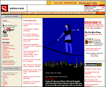 Path-based home pagesLarge Web sites offer so much information to so many audiences that it can be impossible to represent the depth and breadth of the site content in a single home page. In addition, readers often come to a Web site with specific interests or goals in mind. In such cases it is often advantageous to use the home page to split the audience immediately into interest groups and to offer them specific, more relevant information in menu pages deeper within the site. 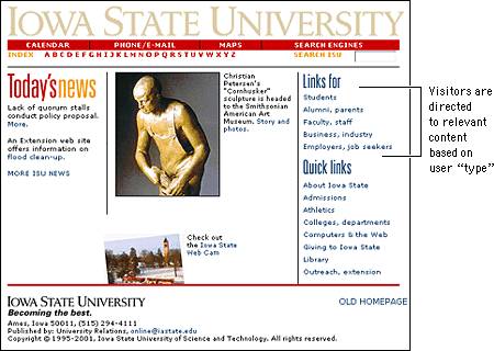 Splash screensSplash screens, or site covers, are the most controversial of all site elements. For many readers, site covers are simply an additional and annoying mouse click between them and the content they are seeking. Such readers would like to be presented with a site index at the start rather than a splash screen with pretty graphics or spiffy animations. The key is to assess your audience and then choose the entry that seems most appropriate. Consider the function of your site. Is your typical visitor there for a single visit or will they visit often? An online tool such as a calendar or search engine should not have a purely aesthetic site cover, because visitors may visit the site several times a day. An elegant but nonfunctional cover on such a site will soon become tedious. Of course, visitors who do not wish to enter through the front door can simply bookmark an internal page of your site, such as the table of contents. But if you find yourself repeatedly making this argument for using a splash screen, you may wish to adapt or even remove your cover to better accommodate your audience. The success of splash screens depends enormously on the expectations of the site visitor. If you were to visit a site about a poet you would enter with different expectations than you would when visiting a site about carpal tunnel syndrome. Visitors to a site about poetry may not simply be out Web foraging but may instead be looking for an experience, for art, for entertainment. A mysterious, enigmatic, aesthetically pleasing facade might just entice such visitors in. 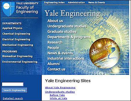 ONE OF THESE FOUR BASIC SCHEMES may dominate the home page design, but increasingly home pages are a complex amalgam of all strategies. The Library of Congress's THOMAS home page mixes images, menu lists, and special interest sections: 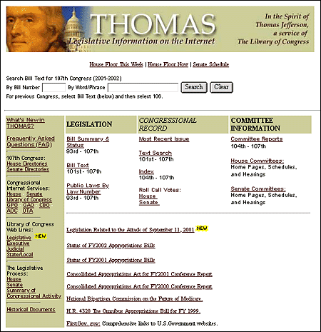 Graphics or text?The primary layout decision you will make about your home page is how heavily you will use graphics on the page. Most corporate, institutional, and education home pages display at least a small graphic banner across the top of the home page, and in commercial sites the trend is rapidly moving toward complex mixtures of links embedded in graphic imagemaps and links in text that emulate the look and functions of CD-ROM multimedia title pages or print magazines. Although strong graphics can be effective at grabbing a browser's attention, large graphic menus impose long loading times for pages, especially for users linking to the Internet via modems or slow network connections. Even if the user is accessing your Web site at Ethernet speeds, graphic menus may still load many times slower than text-based lists of links. This dichotomy between slow-loading but attractive graphics-based home pages and fast-loading but prosaic text-based home pages also reflects the need to address multiple audiences with different expectations. The goals for most Web sites are to transmit internal information (to students, employees, and clients) and to communicate with potential clients and the general Web-browsing public. The Guggenheim Museum has opted for a graphic home page design, but the layout is carefully designed to stay within the dimensions of the average office monitor. Because the graphic area is moderately sized, the page loads reasonably quickly for a graphic menu:  The relatively plain, mostly text-based home page for the World Wide Web Consortium offers an efficient ratio of links per kilobyte of page size, but at some cost in pure visual appeal. The page is fast-loading and well designed for its audience of Web specialists but would not attract the average browser through presentation alone: 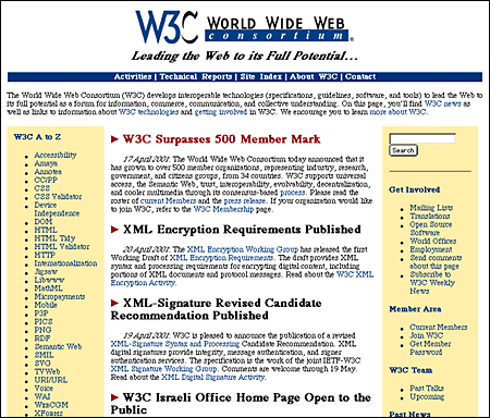 The best way to meet the needs of both casual browsers and highly targeted frequent users is to present alternative views of your Web site. One approach is to make a visually attractive main home page aimed at the general audience of Web browsers but also to offer a more text-oriented alternate home page that emphasizes rapid access to information via detailed text menus. Another approach is to use a graphic banner at the top of the home page, followed by a set of text-based links. The home page for The Atlantic Online reflects this dual approach, with a moderate-sized graphic image topping a well-organized set of text links: 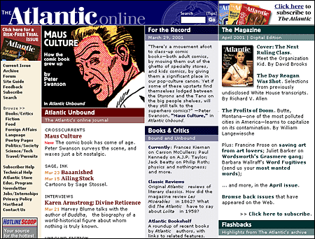 Many Web users who access the Internet via modems choose not to load graphics and thus will not see menu links embedded in imagemap graphics. If you choose to depend on links embedded in imagemaps, it is crucial to provide alternative text-based links that will remain visible even if readers have chosen to turn off the display of graphics. Many sites provide these text-based links in small sizes below the page footer, where they are accessible but do not disrupt the overall design of the page: 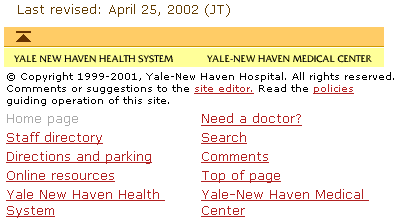 The master page layout gridThe home page usually gets the most attention in the beginning of a Web site design project. Your home page is important, but remember — it is inherently singular. Don't let the design of the home page dominate your site design strategies. When designing a large Web site it's much more important to concentrate on the standard layout grid that all the internal pages of the site will share. After all, you'll have only one home page, but you could easily have thousands of internal pages as the site grows. If you make a mistake on the home page you only have one page to fix. If you make a mistake in creating the basic internal page grid you could soon have thousands of pages to fix. The overall success of the Web site will depend more on a strong, logical page grid than on the appeal of the site's home page. The details of page layout grids are discussed in the following chapters, but we raise the issue of page grids here because it is a crucial design decision when creating a Web site. Think about it: if you tire of your home page, you have only one page to change. Make a big mistake with your page grid and you could end up with thousands of poorly designed pages. Constructing a layout grid usually begins by analyzing the content structure you have worked out and deciding what (besides the all-important home page link) you will need for the most general navigation purposes. Here you are trying to establish what links will be present and generally useful on every page of your Web site. If you work in a corporation or any sizeable government or nonprofit enterprise you must also consider how your particular site fits into the larger context of the other Web sites in your enterprise. Does your enterprise already have an established and successful Web design format that you can adopt? If not, carefully consider what links, logos, and other graphic and functional elements reflecting your place in the larger enterprise should be present on all of your pages. The goal is to establish a logical and consistent approach to where basic graphic identity elements, navigation links, and other essential information appear on every page within your site. Terminology is also crucial here: choose your words carefully for links and titles, and solicit comments and feedback from fellow team members and site users. A misleading or confusing label or phrase can ruin the functionality of a link. A page grid establishes the number, location, and terminology of all major page links and page graphic elements: 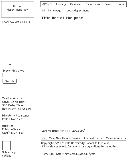
Note that so far we have not discussed specific graphic elements in relation to the page grid. A page grid can be used to enforce a very rigid, visually consistent identity scheme by incorporating information on the exact graphics, logos, fonts, colors, and wording of page elements: However, a page grid is also a great way to allow a variety of visual approaches to site design within an enterprise while maintaining a reasonably consistent navigational interface for the user. All three of these pages, though they use a variety of colors and graphic schemes, share the same underlying page grid that specifies the position and wording of major navigation links and other page elements: 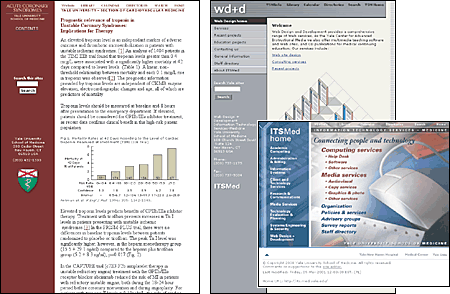 After establishing the internal page grid you can build the site home page on the same underlying grid, so that readers who come to your site are immediately introduced to the page grid, identity graphics, and navigation scheme that is used throughout the site. The home page grid does not have to be identical to the internal page grid; home pages must provide a much wider range of content and navigation elements than the average internal page. For this reason home pages are often much wider to fill the screen and more graphic than the average internal page: 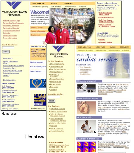 |
|
|