 | |
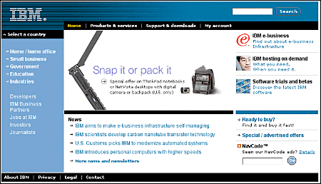
Internet versus intranet designMost Web sites are designed to be viewed by audiences inside an organization and are often not visible to the larger World Wide Web. Although these intranet sites employ the same technology as sites designed for the larger Web audience, their design and content should reflect the different motivations of intranet users. External sites are usually aimed at capturing an audience. The overall goal is to maximize contact time, drawing readers deeper into the site and rewarding their curiosity with interesting or entertaining information. One assumption that governs Web design is that readers may have little motivation to stay and must be constantly enticed and rewarded with rich graphics or compelling information to linger within the site. Successful intranet sites assemble useful information, organize it into logical systems, and deliver the information efficiently. You don't want intranet users lingering over their Web browsers, either in frustration at not being able to find what they are seeking or in idle "surfing." Allow employees and students to get exactly what they need quickly and then move on. The evolution of the WebIn most institutions the use of the World Wide Web has evolved over the past few years from an informal collection of personal or group home pages into a semiorganized collection of sites listed in one or more master home pages or "front door" sites. Ironically, universities and companies that adopted the Web early are often the least organized, because each department and group has over the years evolved its own idiosyncratic approach to graphic design, user interface design, and information architecture. But the Web and institutional intranets are no longer just a playground for the local "geeks." Patchy, heterogeneous design standards and a lack of cohesive central planning can cripple any attempt to realize productivity gains through an intranet. IBM's sites are models of a consistent, in-depth approach to Web design, making it possible for both employees and customers to navigate through a huge, complex information system with one unified visual identity and user interface:  User surveys done at Sun Microsystems in the mid-1990s by user interface expert Jakob Nielsen showed that the average Sun employee used about twelve intranet pages a day and about two new intranet subsites each week, and the numbers are surely many times higher today. Nielsen estimated that his redesign of Sun's intranet user interface would save each employee as much as five minutes a week through consistent companywide application of design and navigation interface standards. The aggregate savings in Sun employee time could amount to as much as ten million dollars a year, through improving productivity and increasing the efficiency with which employees use the company's intranet sites. Consistent, predictable interfaces are the key to a return on the enormous investment enterprises have made in their Web sites and corporate intranets. Section contents |
|
|