Site design themes
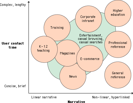
All presentations of information are governed by parameters determined by the objectives, the practical logistics of the chosen medium, and the audience. The figure below plots major themes for information delivery against two fundamental variables — the linearity of the structure of your presentation and the length of the typical user's contact time:

Some general modes of Web use are more structured and depend on audiences who arrive knowing what they wish to accomplish without the need for site-supplied motivation. Corporate intranets, training sites, educational sites, reference sites, and many well-known news and information sites benefit from audiences that know what to expect at a particular site and arrive there with a specific goal in mind. E-commerce and entertainment sites have a complex dual mission to balance: to motivate casual browsers to spend time in the site and become customers as well as to provide fast access to products and information to experienced users.

Naive designers and clients eager to do almost anything to attract attention to a Web site consistently make the mistake of maximizing immediate graphic impact over all other possible attributes of a site design. They have the misguided notion that if you constantly hit the reader between the eyes with a huge, noisy graphic or Flash animation, you will sustain their attention. Sometimes this does work — for about ten to fifteen seconds. "Eye candy" is a quick blast of visual sweets, but you can't build a Web site on a moment's attention. Most readers quickly tire of blaring animated graphics and the long downloads, plug-in compatibility irritations, and distracting stimuli that complicate such sites. A successful site requires real, sustained engagement, and you get that only by offering both sophisticated visual stimuli and a site that is structured to meet the needs of its audience quickly and effectively.
Section contents
|
